- Conversion Party
- Posts
- #79: The Nav Bar Secrets That Boost Conversions
#79: The Nav Bar Secrets That Boost Conversions
Carina Munro
September 04, 2025 • Estimated Reading Time: 4 minutes

Welcome to Conversion Party. This week, we’ve got…
🕳️ CRO Deep Dive: First impressions aren’t visual, they’re functional. Learn how to make your nav bar work harder.
🗺️ Goings On: Not nothin’
🤟Community love spotlight - Charaf | CRO & Landing Pages | Founder of ecomwize.com
🕳️ CRO Deep Dive
The 5 Must Have Elements of a High Converting Navigation Bar
Discover the strategies and tactics you need to optimize for more revenue in ecommerce. In this section we explore data-driven approaches, real world examples, and proven best practices to help you drive more sales and revenue.
Your navigation bar is the silent hero of your site.
It’s the first “decision tree” users face, yet most brands treat it like a design afterthought.
Here’s the data-backed truth: after analyzing 75 top-performing websites, we found 5 elements every high-CVR nav bar shares.
And when users interacted with these elements? They were 4–5x more likely to convert.
Let’s dive in 👇

1. Images Sell, Even in Menus
Visuals aren’t just for product pages. Adding images into dropdowns helps shoppers instantly orient themselves.
Desktop tip: Use thumbnails of top products or categories (like Allbirds showing shoe silhouettes under “Men” and “Women”).
Mobile tip: Keep images simple and fast-loading, a single hero product image per category is often enough.
Pro move: Use badges like “$100 Off” or “Bestseller” to highlight offers directly inside the nav.

2. Clear, Theme-Driven Names
Generic labels like “Products” kill curiosity. Instead, give categories names that carry meaning.
Example: Instead of “Shop” brands like Plunge use “Cold Therapy” or “Sauna”, instantly tied to the value.
Hot tip: Tie menu names back to customer goals (“Better Sleep,” “Stress Relief”) instead of just product categories.
Mobile advantage: Short, scannable names reduce friction when thumbs are moving fast.

3. Testimonials & Social Proof
Your nav bar is a stealth trust-builder. Embedding reviews or ratings where shoppers least expect them = gold.
Example: Casper shows star ratings right in dropdowns beside each mattress type.
Hot tip: Rotate 1-line testimonials or “As seen in” snippets in the nav. It’s subtle, not pushy.
Why it works: It reduces the “is this brand legit?” doubt before the product page even loads.
4. Beyond Shopping Pages
Adding non-shopping links might feel like a distraction, but they increase conversions by building brand depth.
Include links to: FAQs, Learn/Blog, About Us, or even “For Business.”
Example: Gymshark links to workout guides in their nav. Customers don’t just shop; they learn.
Mobile trick: Tuck these under a “Learn” tab so the menu doesn’t feel overwhelming but still earns trust.
Why it works: People who explore these pages convert at 4–5x higher rates because they feel safer buying from an authority.

5. Clickable Buttons & Arrows
Tiny affordances, big results. Clickable arrows, “+” icons, or CTA buttons guide shoppers and reduce guesswork.
Desktop tip: Arrows next to expandable menus make UX intuitive, especially for older or less tech-savvy shoppers.
Mobile must: Big, thumb-friendly tap targets. Nothing kills conversions faster than a fiddly nav on a small screen.
Example: Nike’s mobile nav uses large arrows and collapsible menus so shoppers aren’t scrolling forever.
Pro move: Add micro-CTAs inside the nav (“Shop Now” or “Bundle & Save”) to shorten the path to purchase.

Actionable CRO Checklist: Audit Your Nav Bar Today
Steal this 5-minute checklist and see where your brand stands:
✔️ Do your dropdowns include helpful visuals (product images, badges, icons)?
✔️ Are your menu names clear, themed, and benefit-led (not just generic labels)?
✔️ Have you embedded reviews, ratings, or trust signals right in your nav?
✔️ Do you link to non-shopping trust pages (FAQs, About, Blog, Learn)?
✔️ Are all menu items easy to tap/click, especially on mobile?
Want the full expanded checklist?
The Bottom Line
Your nav bar is conversion real estate. It’s the front door, the welcome mat, and the first impression all rolled into one.
The brands winning at CRO don’t just make navigation functional, they make it persuasive.
Ready to uncover the hidden friction points on your site?
Sign up for heatmap to get the behavioral data and insights you need to make smart, data-backed decisions.
Want to learn more about other success stories?
📖 Read more about them here →
🗺️ GOINGS ON
Not Nothin’
Stay in the loop with our latest partner activations, from webinars and in-person meetups to fresh content collaborations. We’ll highlight upcoming events, share key takeaways from recent gatherings, and give you an inside look at what’s brewing in our network.
D2C Diaries Pod - £10M+ E-commerce CRO Tactics with Dylan Ander
CRO is the growth lever 99% of DTC brands are ignoring. In this episode, Olly is joined by Dylan Ander, ex-agency owner, 2x eCom founder, and now the creator of Heatmap.com, the CRO tool quietly powering some of the highest-performing brands online.
They break down the post-click strategies the top 1% are using to scale profitably and why your landing page might matter more than your creative.
Why CRO is the real 80/20 of DTC growth
What metrics actually matter (hint: not conversion rate)
Why you should stop sending traffic to over-engineered PDPs
How Dylan helped brands unlock 7 figures from simple CRO tweaks
Tactical wins around landing pages, AOV, revenue per session & more
This is a must-listen for founders, creative strategists, and media buyers looking to scale beyond the click.
Q4 Summit NYC! Your holiday playbook starts here
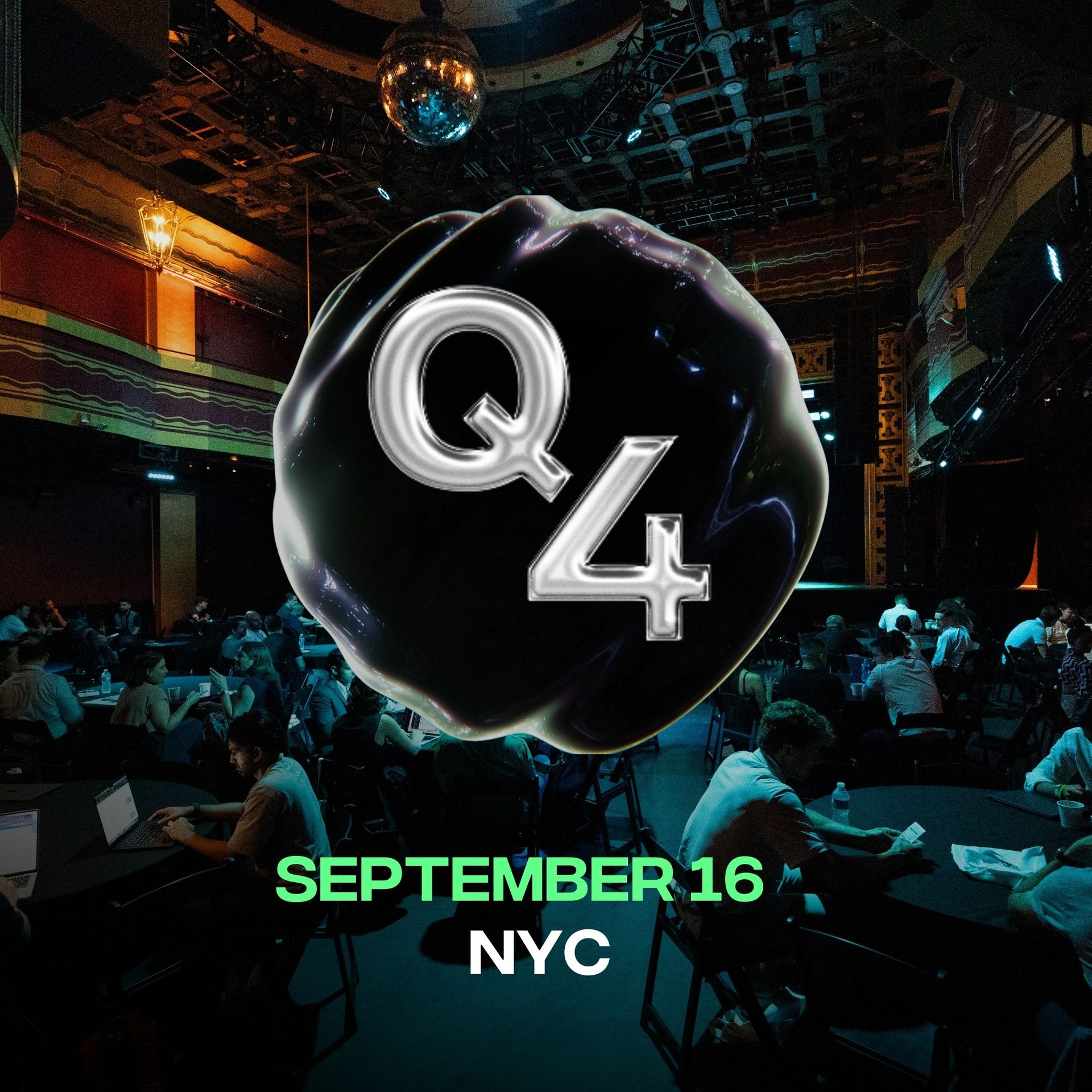
EcomFounders (the crew behind Ecom AI Summit, Shoptalk’s biggest party, and past Q4 Summits with leaders like Keith Rabois, Sandra Campos, and Harley Finkelstein) is BACK in NYC this September.
Last year we packed Terminal 5 with 500+ brand operators sharing exactly how to win the holiday season.
This year, Q4 Summit 2025 is going even bigger:
→ The most impactful strategies to crush your holiday targets
→ Candid insights from operators actually doing it
→ Networking with the top brands, investors, and partners in the game
Limited Supply Pod - Landing Page Roast With Dylan Ander
In this episode, “Landing Page Roast with Dylan Ander,” we dive into what makes, or breaks, a winning ecommerce landing page.
From pop-up pitfalls and clunky FAQs to smart upsells and simplified design, Dylan dishes out brutally honest, actionable feedback you can apply right away. Get ready for a roast that’ll have you auditing your own site before the episode is halfway through. If you want your landing page to truly land, this one’s for you!
🤟 COMMUNITY LOVE
Our featured tweet of the week, where we share bite-sized insights or a quick tip that’s making waves in the world of e-commerce. Consider it your fast track to staying updated on what’s trending.
Recent hero redesigns by my team at Ecomwize.
The focus? Social proof and lifestyle imagery above the fold to instantly build trust and credibility.
— Charaf | CRO & Landing Pages (@charaf_ecomwize)
6:57 PM • Jul 23, 2025
☎️ Interested in learning more about heatmap? Schedule a demo.
💫 Wanna be featured? Email carina at heatmap dot com.