- Conversion Party
- Posts
- #103: 5 Mobile UX Mistakes Killing Your Conversion
#103: 5 Mobile UX Mistakes Killing Your Conversion
Carina Munro
April 09, 2026 • Estimated Reading Time: 3 minutes

Welcome to Conversion Party. This week, we’ve got…
🕳️ CRO Deep Dive: Most ecommerce traffic is mobile. Most mobile experiences still convert poorly. Here’s what to fix.
NEW HEATMAP UPDATE: Journey Analysis is here
🗺️ Goings On: Not nothin’
🤟Community spotlight - Shoplift | A/B testing for Shopify stores
🕳️ CRO Deep Dive
5 Mobile UX Fixes That Increase Conversion Fast
Discover the strategies and tactics you need to optimize for more revenue in ecommerce. In this section we explore data-driven approaches, real world examples, and proven best practices to help you drive more sales and revenue.
Most ecommerce traffic today is mobile.
But most ecommerce experiences?
Still optimized for desktop.
That gap is where a lot of revenue gets lost.
Because mobile users don’t browse the same way.
They scan. They tap. They abandon quickly.
Let’s fix the biggest mobile UX mistakes we see.
Here are 5 Mobile UX Fixes That Increase Conversion Fast
1️⃣ Win #1: Your CTA Isn’t Always Visible
If users can’t see the “Add to Cart” button, they can’t convert.
The mistake
On many mobile PDPs, the CTA disappears as users scroll.
This forces them to hunt for the next step.
🛠 Fix it
• Add a sticky Add-to-Cart button
• Keep it visible as users scroll
• Make it large and easy to tap
Visibility drives action.
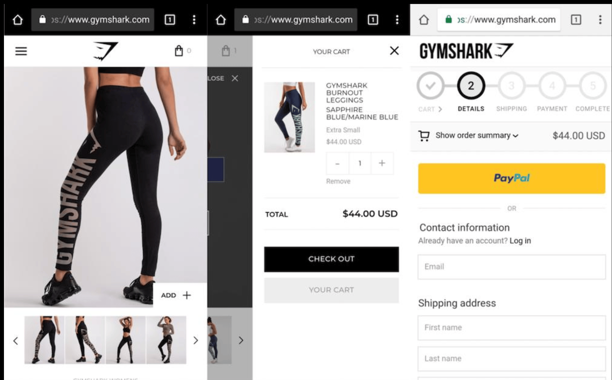
✅ Good (Gymshark): Sticky Add to Cart always visible
❌ Bad: CTA disappears when you scroll
2️⃣ Win #2: Your Layout Is Too Dense
Mobile users don’t read, they scan.
The mistake
Walls of text, tight spacing, and cluttered layouts overwhelm users.
🛠 Fix it
• Break content into sections
• Use bullet points
• Increase spacing
• Prioritize key information
Make your page easy to scan in seconds.
✅ Good (Allbirds): Clean spacing, easy to scan
❌ Common issue: Dense text, cluttered layout
3️⃣ Win #3: Your Images Don’t Answer Key Questions
Mobile users rely heavily on visuals to decide.
The mistake
Images look good, but don’t provide clarity.
Users can’t quickly understand:
• size
• texture
• use case
• details
🛠 Fix it
Include:
• close-up product shots
• in-use visuals
• size references
• feature callouts
Good images reduce hesitation.
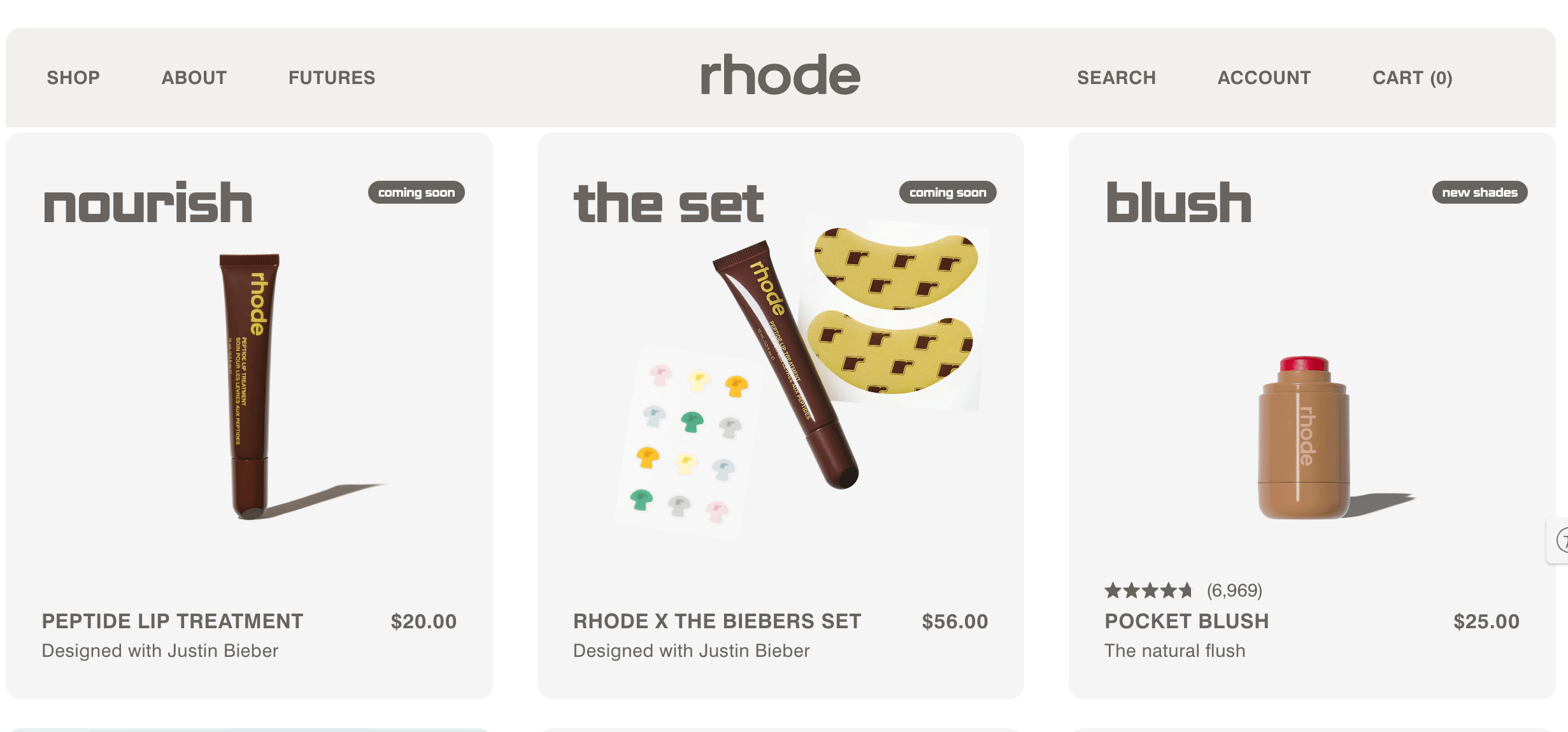
✅ Good (Rhode): Clear product detail + usage
❌ Common issue: Lifestyle-heavy, lacks clarity
🔎 Quick CRO Check
Curious how your mobile experience performs?
Run your site through the AI CRO Site Scanner and uncover:
✔ Mobile UX friction
✔ CTA visibility issues
✔ Messaging gaps
✔ Conversion blockers
Want to see where your revenue per session is leaking?
4️⃣ Win #4: Your Forms Are Too Hard to Complete
Typing friction kills mobile conversions.
The mistake
Long forms, small input fields, and unnecessary steps.
🛠 Fix it
• Minimize required fields
• Enable autofill
• Use larger input areas
• Optimize keyboard types (email, number, etc.)
Make completing checkout effortless.
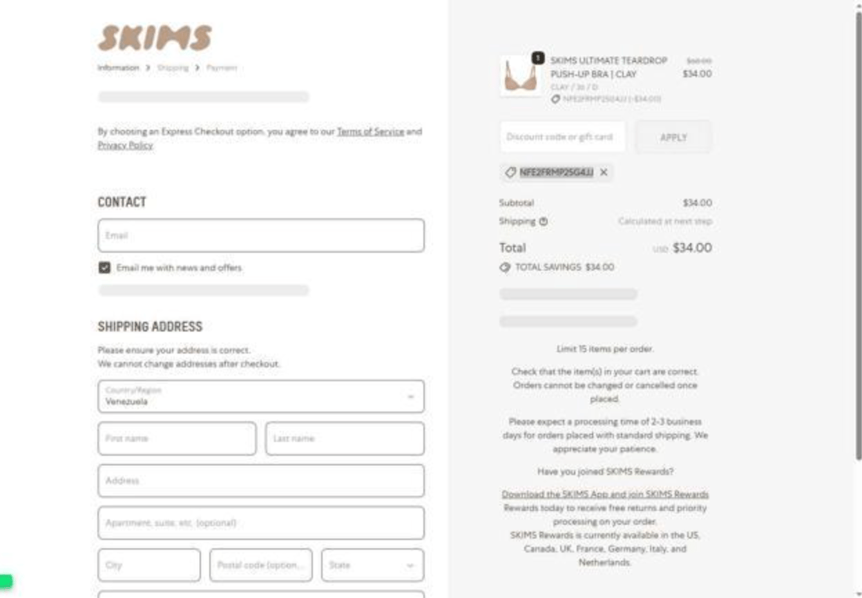
✅ Good: Minimal inputs, autofill, fast payment
❌ Bad (SKIMS): Long forms, too many fields, friction in checkout
5️⃣ Win #5: You’re Not Studying Mobile Behavior Separately
Mobile behavior is fundamentally different from desktop.
The mistake
Looking at combined data across devices.
This hides mobile-specific friction.
🛠 Fix it
Analyze:
• tap behavior
• scroll patterns
• drop-offs
• navigation flow
✅ Good: Clear mobile journey + behavior insights
❌ Common issue: Generic analytics, no mobile-specific insight
With tools like journey analysis and behavioral tracking, you can see exactly how mobile users move through your site, and where they abandon.
Bottom Line
Mobile isn’t just smaller screens.
It’s different behavior.
To improve conversion:
• keep actions visible
• simplify layouts
• answer questions visually
• reduce typing friction
• analyze mobile-specific behavior
Fix mobile UX, and conversion improves across your entire funnel.
🚀 NEW FEATURE: Journey Analysis is here
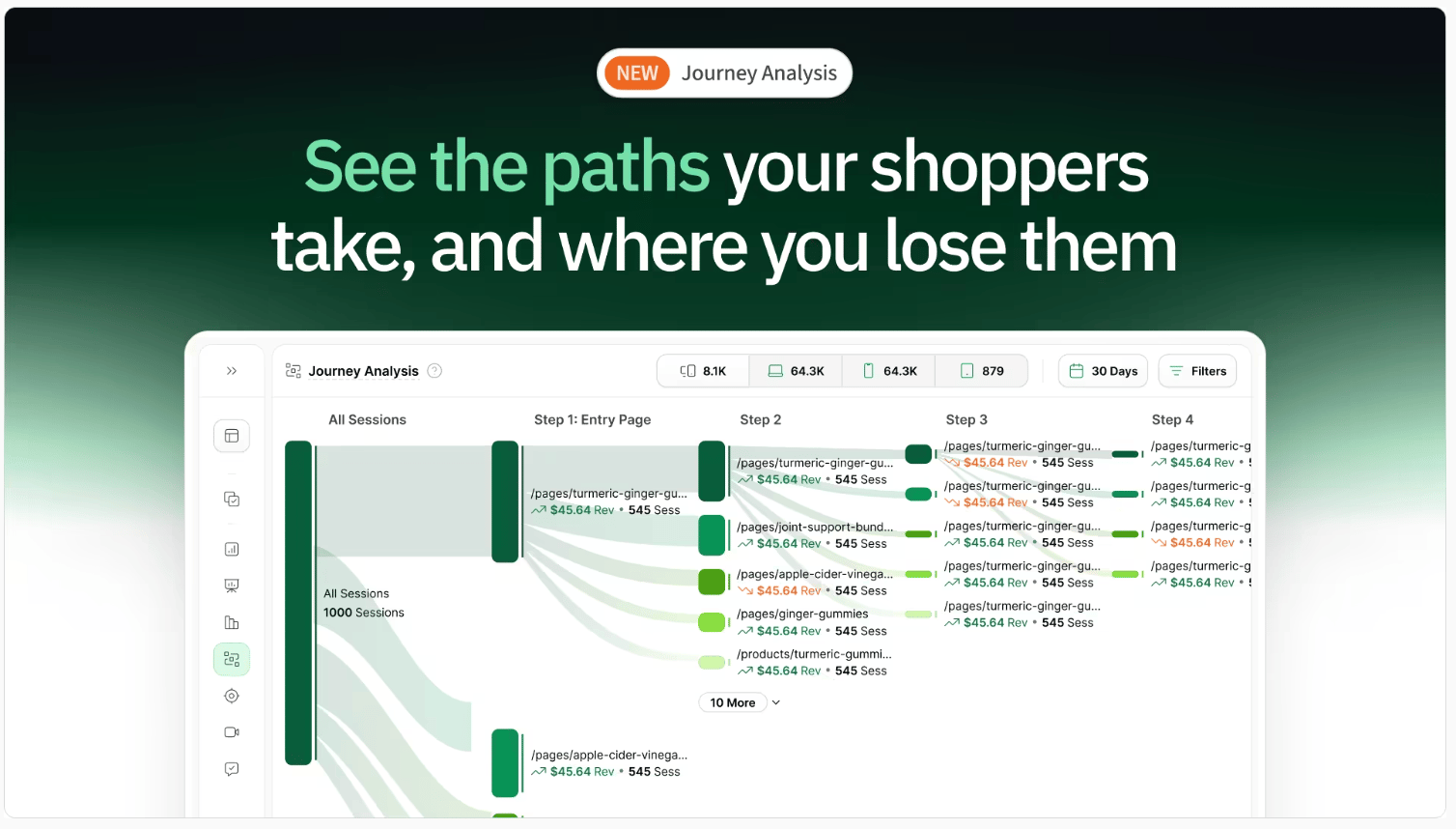
Most ecommerce teams optimize their site one page at a time.
Homepage.
Product page.
Cart.
Checkout.
But shoppers don’t experience your site like that.
They move through it.
They compare.
They hesitate.
They loop.
They drop off.
And most tools don’t show you that.
They show isolated pages, not the full journey.
So you’re left guessing:
Where did we lose them?
What path actually led to purchase?
What should we fix first?
We just launched Journey Analysis to fix that.
You can now see:
→ The actual paths shoppers take through your site
→ Where high-intent shoppers drop off
→ Which journeys lead to the most revenue
→ Unexpected behaviors you wouldn’t catch otherwise
This changes how you optimize.
Instead of improving pages in isolation, you can focus on the journeys that actually drive performance.
Want to See Where Mobile Users Drop Off?
Run your site through the AI CRO Site Scanner and instantly uncover:
✔ Mobile conversion leaks
✔ UX friction
✔ High-impact fixes
✔ What to prioritize first
Need Help Improving Mobile Conversion?
Book a free call with our CRO team.
We’ll identify your biggest mobile UX opportunities and help you prioritize fixes.
Bonus: 150-Point CRO Checklist
If conversion optimization is a priority this quarter, this checklist ensures you’re not missing foundational wins.
Ready to uncover the hidden friction points on your site?
Get the behavioral data you need to make smarter, data-backed decisions.
Want to learn more about other success stories?
📖 Read more about them here →
🗺️ GOINGS ON
Not Nothin’
Stay in the loop with our latest partner activations, from webinars and in-person meetups to fresh content collaborations. We’ll highlight upcoming events, share key takeaways from recent gatherings, and give you an inside look at what’s brewing in our network.
Instant Spring Event 2026

Instant is unveiling what comes next for AI in Shopify.
From building to optimization, everything is moving faster, smarter, and more automated. They’re hosting a fast-paced online product event showcasing their biggest product updates yet. Save your spot here.
🤟 COMMUNITY LOVE
Our featured tweet of the week, where we share bite-sized insights or a quick tip that’s making waves in the world of e-commerce. Consider it your fast track to staying updated on what’s trending.
☎️ Interested in learning more about heatmap? Schedule a demo.
💫 Wanna be featured? Email carina at heatmap dot com.