- Conversion Party
- Posts
- #107: 4 Homepage Mistakes Killing First Impressions
#107: 4 Homepage Mistakes Killing First Impressions
Carina Munro
May 07, 2026 • Estimated Reading Time: 4 minutes

Welcome to Conversion Party. This week, we’ve got…
🕳️ CRO Deep Dive: Visitors decide fast. Here’s what’s making your homepage lose trust and attention immediately.
NEW HEATMAP UPDATE: Journey Analysis is here
🗺️ Goings On: Not nothin’
🤟Community love - Osh | CRO & Landing Pages
🕳️ CRO Deep Dive
5 Homepage Fixes That Increase Engagement (and Conversion)
Discover the strategies and tactics you need to optimize for more revenue in ecommerce. In this section we explore data-driven approaches, real world examples, and proven best practices to help you drive more sales and revenue.
Your homepage has about 3 seconds to answer one question:
“Am I in the right place?”
If that answer isn’t immediately clear…
Visitors bounce.
Not because your product is bad.
Not because traffic is low.
But because your homepage failed to create clarity, trust, and momentum fast enough.
And when first impressions break, conversion drops everywhere else in the funnel too.
Let’s fix the biggest homepage mistakes we see.
1️⃣ Win #1: Your Value Proposition Isn’t Clear Enough
Visitors shouldn’t have to figure out what you sell.
The mistake
Your homepage headline is:
• too vague
• too clever
• too focused on branding
Users land and still don’t understand:
• what the product is
• who it’s for
• why it matters
🛠 Fix it
Make your value proposition instantly obvious:
• what you sell
• who it helps
• why it’s different
👉 Clarity converts better than cleverness.
✅ Good: Clear headline that explains the product immediately
❌ Bad: Brand-heavy messaging with no obvious value proposition
2️⃣ Win #2: Your Homepage Doesn’t Guide the Next Step
Visitors need direction immediately.
The mistake
Your homepage feels like a wall of content with no obvious path forward.
Users don’t know:
• where to click
• what matters most
• what to explore first
🛠 Fix it
Guide attention intentionally:
• strong primary CTA
• featured collections
• best sellers
• simplified navigation
👉 Good homepages reduce decision fatigue.
✅ Good: Clear next action above the fold
❌ Bad: Too many competing directions and links
3️⃣ Win #3: Your Homepage Looks Busy on Mobile
Mobile users scan fast, clutter kills momentum.
The mistake
Too many:
• banners
• popups
• sections
• competing visuals
The experience feels overwhelming.
🛠 Fix it
Simplify the mobile experience:
• reduce visual noise
• tighten spacing
• prioritize key sections
• keep important actions visible
👉 Simplicity improves engagement.
✅ Good: Clean mobile layout with clear hierarchy
❌ Bad: Crowded homepage with competing elements everywhere
🔎 Quick CRO Check
Not sure what’s hurting your homepage conversion?
Run your site through the AI CRO Site Scanner and instantly uncover:
✔ Clarity issues
✔ Homepage friction
✔ CTA visibility problems
✔ Revenue-impacting UX mistakes
4️⃣ Win #4: You Don’t Build Trust Fast Enough
Trust must happen before users explore deeper.
The mistake
Your homepage lacks:
• reviews
• social proof
• credibility signals
• reassurance
Users hesitate because nothing validates the brand quickly.
🛠 Fix it
Add trust early:
• review counts
• press mentions
• guarantees
• UGC
• customer results
👉 Trust increases exploration and conversion.
✅ Good: Trust signals visible near the top of the homepage
❌ Bad: No credibility indicators before users scroll deeply
5️⃣ Win #5: You’re Not Tracking Homepage Behavior
Most homepage issues become obvious when you study behavior.
The mistake
Only looking at:
• bounce rate
• overall conversion rate
But ignoring:
• scroll behavior
• CTA engagement
• navigation paths
• hesitation points
🛠 Fix it
Track how users actually interact with the homepage:
• where attention drops
• which sections get ignored
• where users click next
• where momentum breaks
With tools like heatmaps and journey analysis, you can see exactly how users experience your homepage, and which elements are helping or hurting conversion.
✅ Good: Visibility into engagement and user flow
❌ Bad: No insight into how visitors interact with the homepage
Bottom Line
Your homepage sets the tone for the entire customer journey.
If it creates confusion, friction, or hesitation…
Everything downstream gets harder.
To improve homepage conversion:
• clarify your value proposition
• guide the next step
• simplify mobile UX
• build trust quickly
• track behavior patterns
Fix the first impression, and the rest of the funnel gets stronger.
🚀 NEW FEATURE: Journey Analysis is here
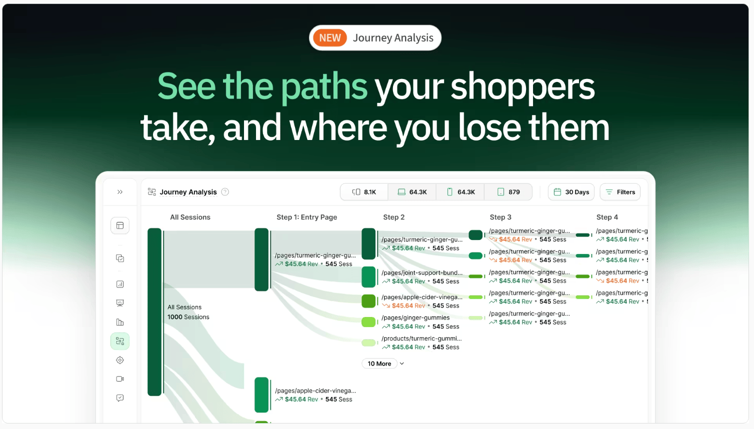
Most ecommerce teams optimize their site one page at a time.
Homepage.
Product page.
Cart.
Checkout.
But shoppers don’t experience your site like that.
They move through it.
They compare.
They hesitate.
They loop.
They drop off.
And most tools don’t show you that.
They show isolated pages, not the full journey.
So you’re left guessing:
Where did we lose them?
What path actually led to purchase?
What should we fix first?
We just launched Journey Analysis to fix that.
You can now see:
→ The actual paths shoppers take through your site
→ Where high-intent shoppers drop off
→ Which journeys lead to the most revenue
→ Unexpected behaviors you wouldn’t catch otherwise
This changes how you optimize.
Instead of improving pages in isolation, you can focus on the journeys that actually drive performance.
Want to See What’s Hurting Your Homepage Conversion?
Run your site through the AI CRO Site Scanner and instantly uncover:
✔ Homepage friction
✔ Clarity issues
✔ CTA visibility problems
✔ High-impact conversion leaks
Need Help Improving Your Homepage Conversion?
Book a free call with our CRO team.
We’ll identify the biggest friction points on your homepage and show you how to improve engagement and conversion.
Bonus: 150-Point CRO Checklist
If conversion optimization is a priority this quarter, this checklist ensures you’re not missing foundational wins.
Ready to uncover the hidden friction points on your site?
Get the behavioral data you need to make smarter, data-backed decisions.
Want to learn more about other success stories?
📖 Read more about them here →
🗺️ GOINGS ON
Not Nothin’
Stay in the loop with our latest partner activations, from webinars and in-person meetups to fresh content collaborations. We’ll highlight upcoming events, share key takeaways from recent gatherings, and give you an inside look at what’s brewing in our network.
The Whalies 2026

The Whalies are back, and it’s where the best ecommerce brands, operators, and agencies get recognized for what drives growth.
From creative and retention to CRO and analytics, this is a snapshot of what top-performing teams are doing right now.
If you’re serious about improving performance this year, this is worth paying attention to.
Shoplift Skincare CRO Playbook

What actually improves conversion for skincare brands?
This session with Shoplift breaks down the CRO strategies high-performing skincare brands use to improve product discovery, increase trust, and drive more revenue per visitor.
Tactical, actionable, and worth adding to your swipe file.
🤟 COMMUNITY LOVE
This week’s CRO insight: Something worth testing. A quick idea from the community that stood out this week.
☎️ Interested in learning more about heatmap? Schedule a demo.
💫 Wanna be featured? Email carina at heatmap dot com.