- Conversion Party
- Posts
- #104: 4 Category Page Mistakes Costing You Revenue
#104: 4 Category Page Mistakes Costing You Revenue
Carina Munro
April 16, 2026 • Estimated Reading Time: 4 minutes

Welcome to Conversion Party. This week, we’ve got…
🕳️ CRO Deep Dive: Your collection pages drive product discovery. Here’s what’s quietly hurting conversion.
NEW HEATMAP UPDATE: Journey Analysis is here
🗺️ Goings On: Not nothin’
🤟Community spotlight - Jeff Park | landing pages + cro for shopify brands
🕳️ CRO Deep Dive
5 Category Page Fixes That Increase Product Discovery (and Sales)
Discover the strategies and tactics you need to optimize for more revenue in ecommerce. In this section we explore data-driven approaches, real world examples, and proven best practices to help you drive more sales and revenue.
Most ecommerce brands focus on product pages.
But before shoppers ever reach a product…
They pass through your category pages.
And if those pages don’t guide decisions quickly, you lose revenue before intent even builds.
Let’s fix the biggest category page mistakes we see.
Here are 5 Category Page Fixes That Increase Product Discovery (and Sales)
1️⃣ Win #1: Your Product Grid Doesn’t Prioritize Best Sellers
Shoppers look for signals, not just options.
The mistake
Most category pages show products in a default or random order.
But users want to see:
• what’s popular
• what others are buying
• what’s worth their time
🛠 Fix it
Prioritize:
• Best sellers first
• “Most popular” badges
• High-review products
Guide attention to proven products.
✅ Good: Best sellers + “most popular” badges guide attention
❌ Bad: Random grid with no prioritization or signals
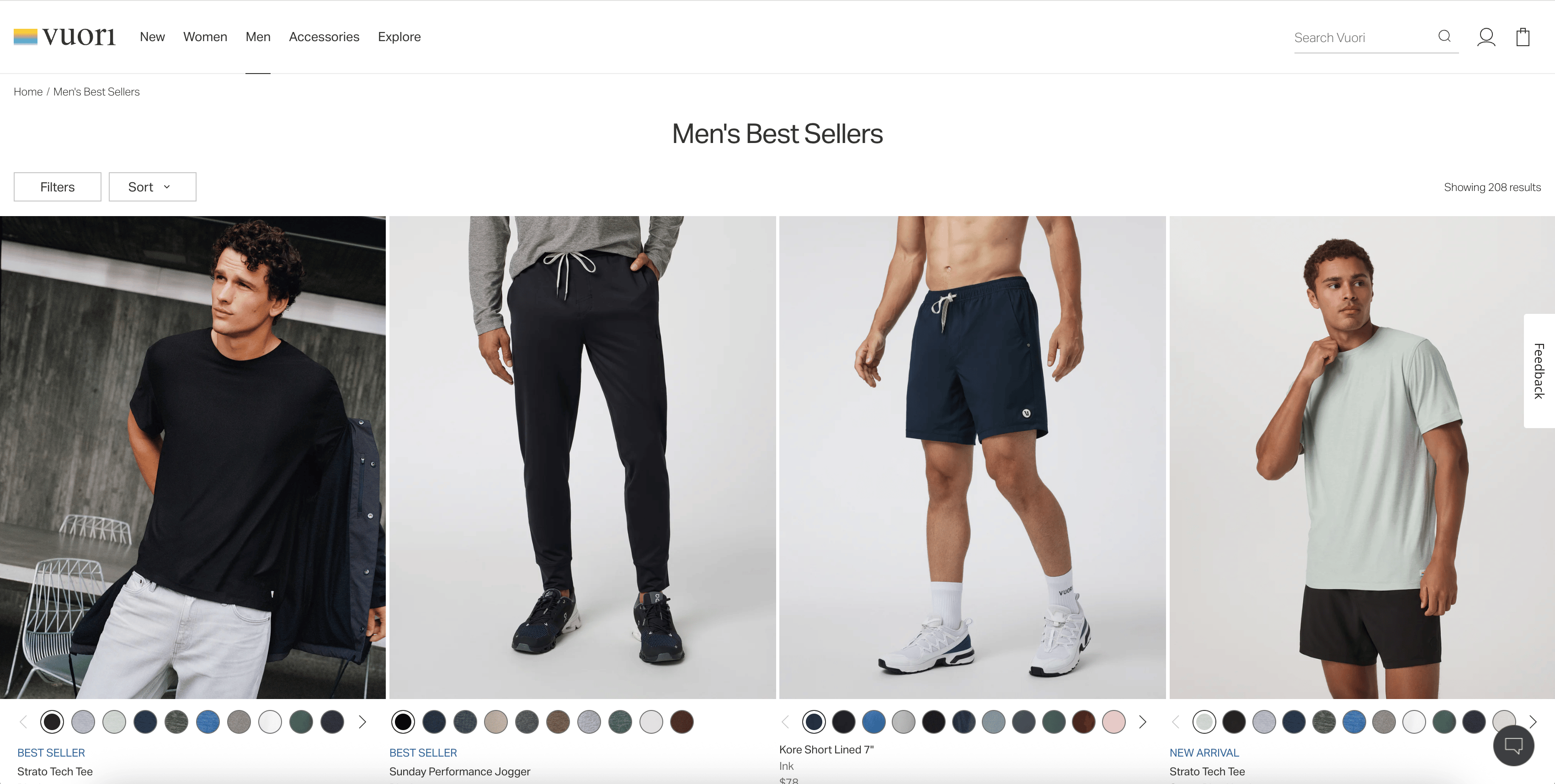
💡 Example (Vuori): Best sellers and popular items are surfaced immediately
→ Shoppers don’t have to guess what’s worth clicking
2️⃣ Win #2: Your Filters Create Friction Instead of Clarity
Filters should simplify decisions, not overwhelm users.
The mistake
Too many filters, unclear labels, or hidden menus.
Users get stuck instead of progressing.
🛠 Fix it
• Keep filters relevant and simple
• Use common language (size, color, price)
• Make filters easy to access on mobile
• Show active selections clearly
Reduce effort, increase momentum.
✅ Good: Clean, simple filters (size, color, price)
❌ Bad: Overloaded filters, hard to navigate
💡 Example (Princess Polly): Simple, intuitive filters (size, color, price)
→ Reduces friction and speeds up decision-making
3️⃣ Win #3: Your Product Cards Don’t Give Enough Information
Users decide what to click based on what they see in the grid.
The mistake
Product cards only show:
• image
• name
• price
That’s often not enough.
🛠 Fix it
Add clarity to product cards:
• ratings / reviews
• quick benefits
• color options
• badges (best seller, new, etc.)
More context = more clicks.
✅ Good: Ratings, badges, color options, helpful context
❌ Bad: Just image + price → no decision support
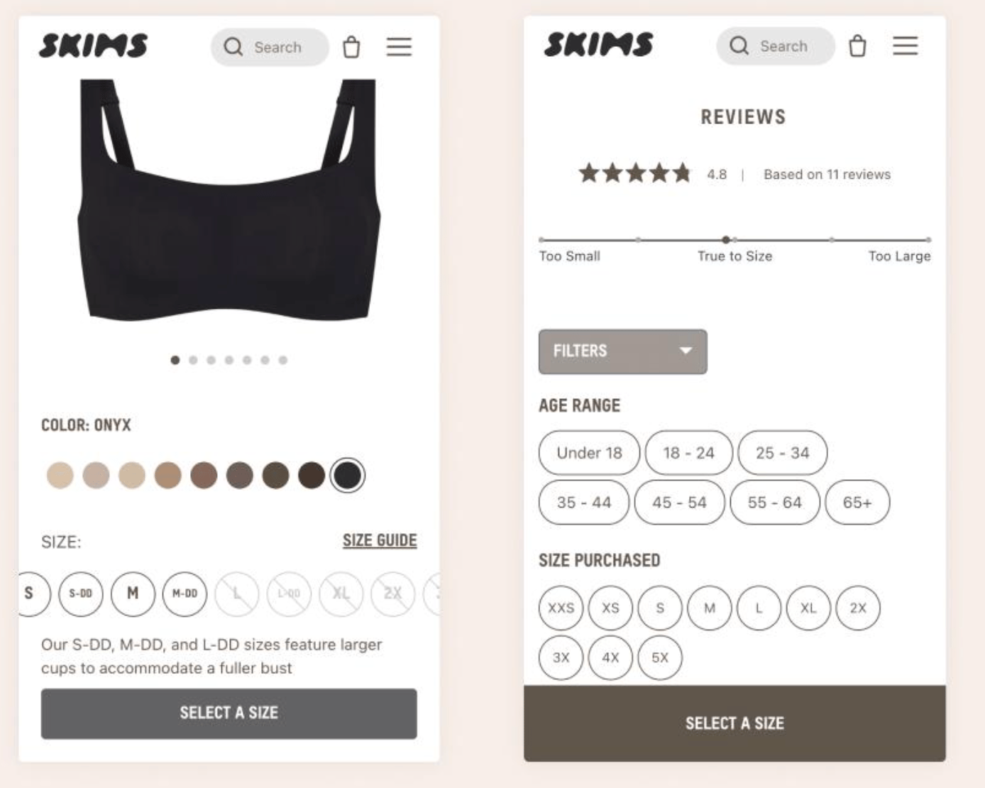
💡 Example (SKIMS): Product cards show pricing, variants, clear product context
→ Users can quickly compare and decide what to click without extra effort
🔎 Quick CRO Check
Curious how users navigate your category pages?
Run your site through the AI CRO Site Scanner and uncover:
✔ Product discovery issues
✔ Navigation friction
✔ Drop-off points
✔ Revenue-impacting problems
Curious how your mobile experience performs?
4️⃣ Win #4: Your Category Page Doesn’t Guide Next Actions
Category pages should move users forward, not leave them wandering.
The mistake
No clear direction after users land.
They scroll… but don’t know what to do next.
🛠 Fix it
Guide behavior with:
• “Shop best sellers” sections
• “Most popular” rows
• featured collections
• clear sorting defaults
Make the next step obvious.
✅ Good: Clear sections that guide browsing
❌ Bad: Endless scroll with no structure or guidance
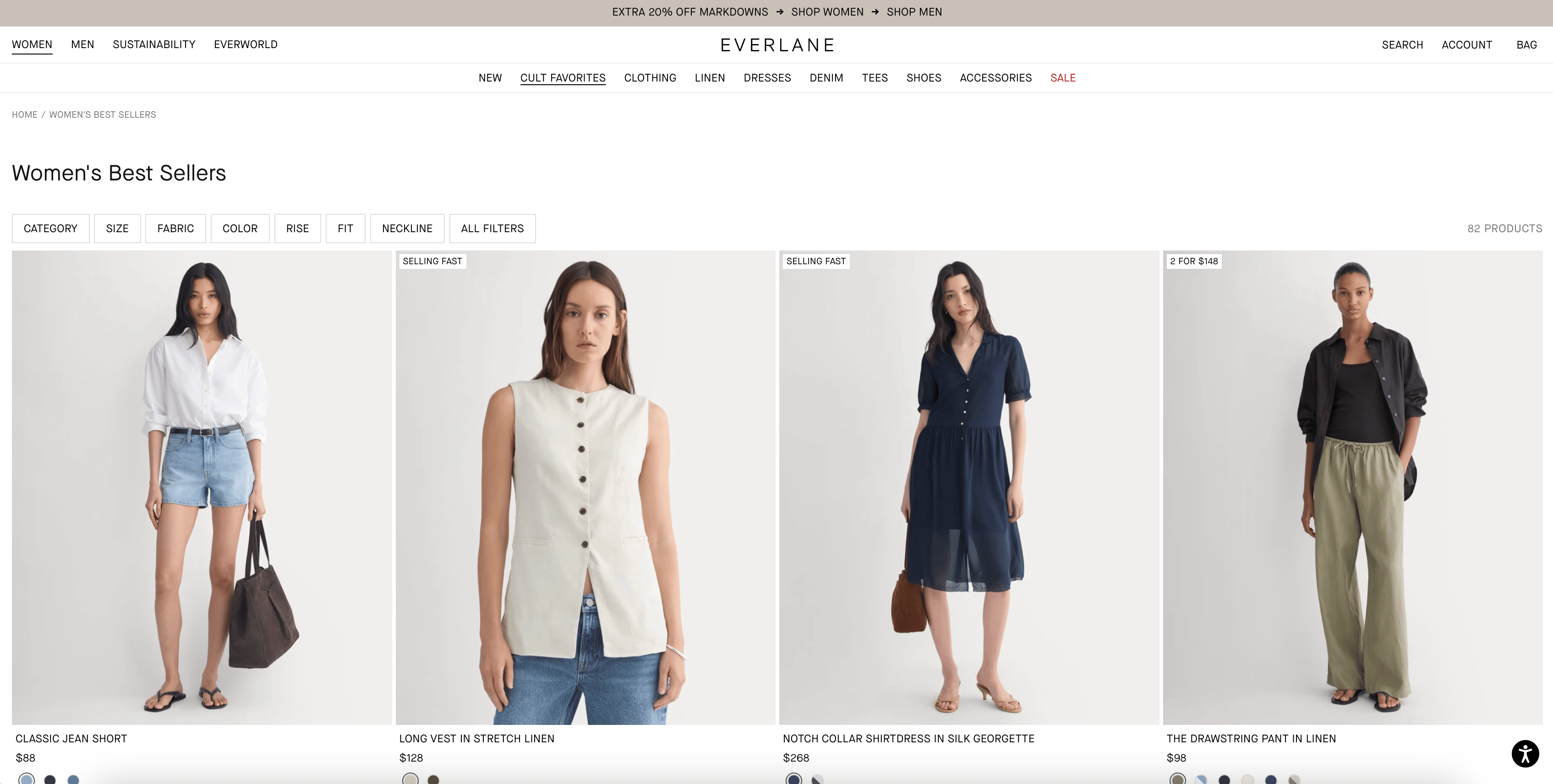
💡 Example (Everlane): Sections like “Best Sellers” and “Top Rated” guide browsing
→ Makes product discovery feel structured instead of overwhelming
5️⃣ Win #5: You’re Not Tracking Product Discovery Behavior
The biggest leaks happen before users even reach a product page.
The mistake
Most teams only analyze:
• PDP conversion
• checkout performance
But ignore how users get there.
🛠 Fix it
Track:
• product clicks from category pages
• filter usage
• scroll depth
• navigation paths
With tools like journey analysis and behavioral tracking, you can see which category page interactions lead to product views, and which ones cause drop-off.
Bottom Line
Category pages don’t just display products.
They shape how users discover, evaluate, and choose what to click.
To improve performance:
• prioritize best sellers
• simplify filters
• add context to product cards
• guide browsing behavior
• track discovery patterns
Fix this layer, and everything downstream improves.
🚀 NEW FEATURE: Journey Analysis is here
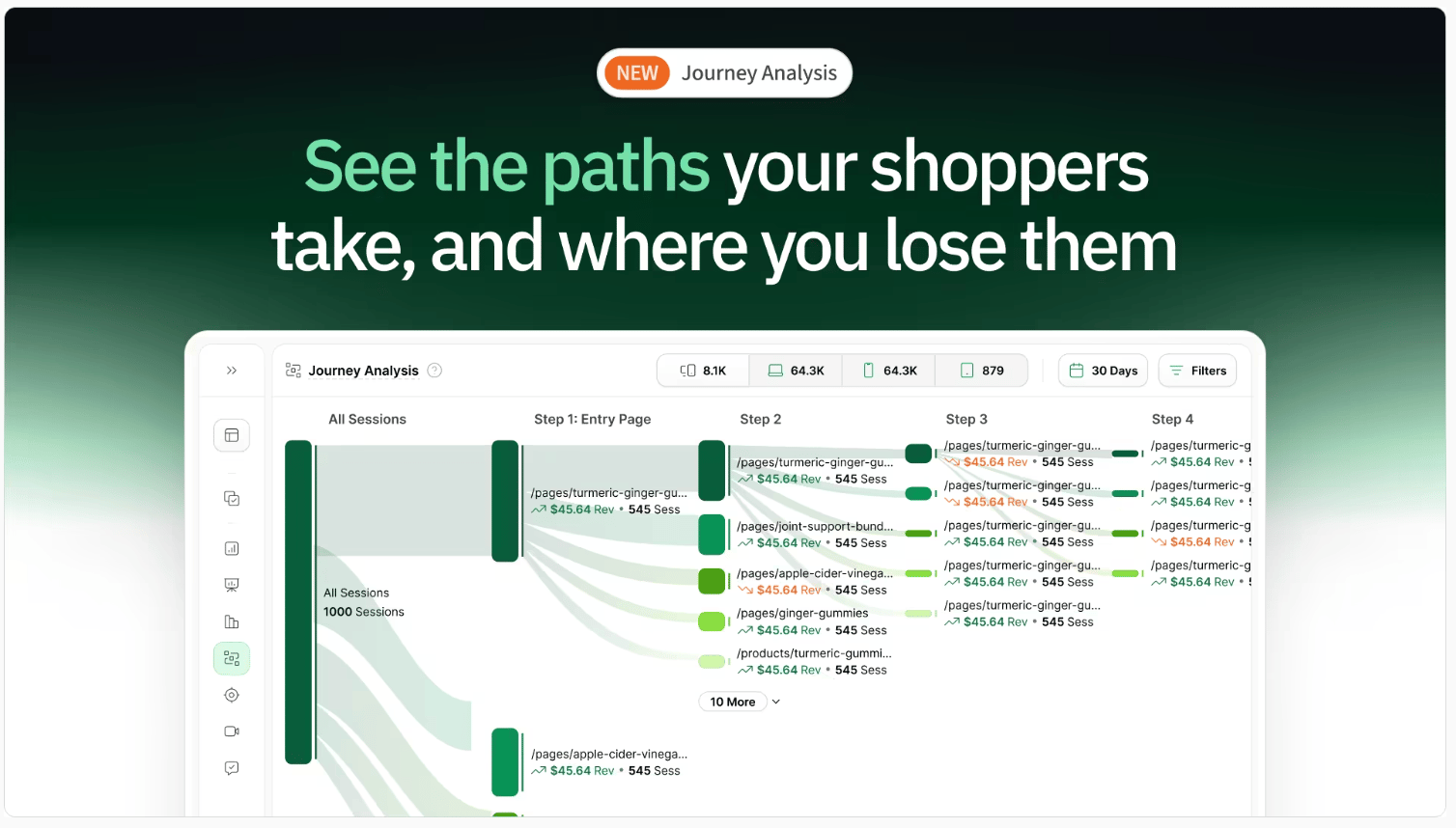
Most ecommerce teams optimize their site one page at a time.
Homepage.
Product page.
Cart.
Checkout.
But shoppers don’t experience your site like that.
They move through it.
They compare.
They hesitate.
They loop.
They drop off.
And most tools don’t show you that.
They show isolated pages, not the full journey.
So you’re left guessing:
Where did we lose them?
What path actually led to purchase?
What should we fix first?
We just launched Journey Analysis to fix that.
You can now see:
→ The actual paths shoppers take through your site
→ Where high-intent shoppers drop off
→ Which journeys lead to the most revenue
→ Unexpected behaviors you wouldn’t catch otherwise
This changes how you optimize.
Instead of improving pages in isolation, you can focus on the journeys that actually drive performance.
Want to See Where Product Discovery Breaks Down?
Run your site through the AI CRO Site Scanner and instantly uncover:
✔ Product discovery friction
✔ Navigation issues
✔ Drop-off points
✔ High-impact CRO fixes
Need Help Improving Your Category Pages?
Book a free call with our CRO team.
We’ll identify your biggest product discovery gaps and help you increase conversion.
Bonus: 150-Point CRO Checklist
If conversion optimization is a priority this quarter, this checklist ensures you’re not missing foundational wins.
Ready to uncover the hidden friction points on your site?
Get the behavioral data you need to make smarter, data-backed decisions.
Want to learn more about other success stories?
📖 Read more about them here →
🗺️ GOINGS ON
Not Nothin’
Stay in the loop with our latest partner activations, from webinars and in-person meetups to fresh content collaborations. We’ll highlight upcoming events, share key takeaways from recent gatherings, and give you an inside look at what’s brewing in our network.
Instant Spring Event 2026

Instant is unveiling what comes next for AI in Shopify.
From building to optimization, everything is moving faster, smarter, and more automated. They’re hosting a fast-paced online product event showcasing their biggest product updates yet. Save your spot here.
🤟 COMMUNITY LOVE
This week’s CRO insight: Something worth testing. A quick idea from the community that stood out this week.
☎️ Interested in learning more about heatmap? Schedule a demo.
💫 Wanna be featured? Email carina at heatmap dot com.